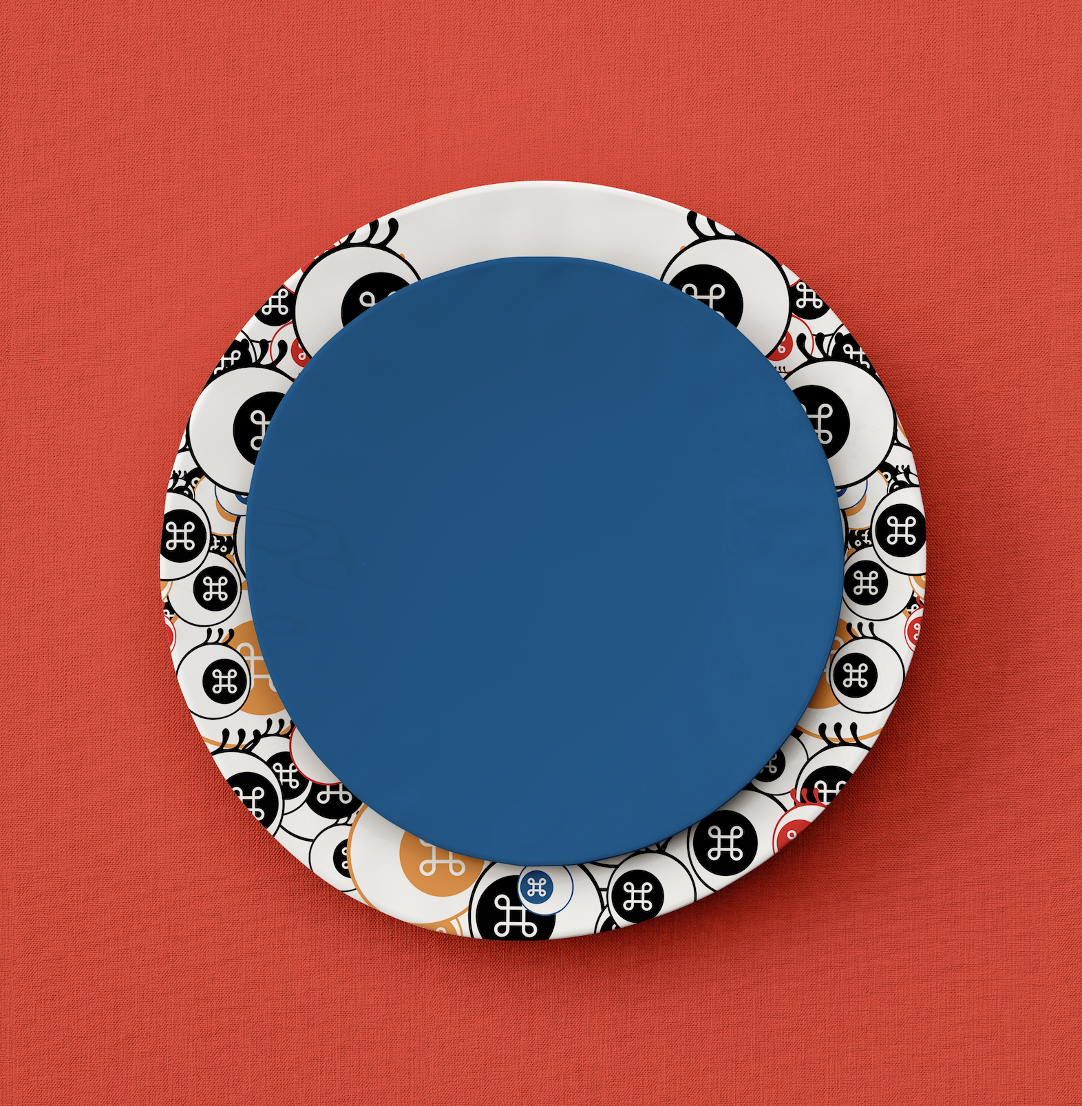
YAMI YAM!
BRAND IDENTITY
YAMI YAM! is not just a cafe; it's an immersive experience that encapsulates the essence of consumerism and capitalism within the vibrant city of San Francisco. Combining the allure of modern city life with the aesthetic influence of the super flat art movement, YAMI YAM! presents a unique and captivating atmosphere for its patrons.
︎ BRANDING


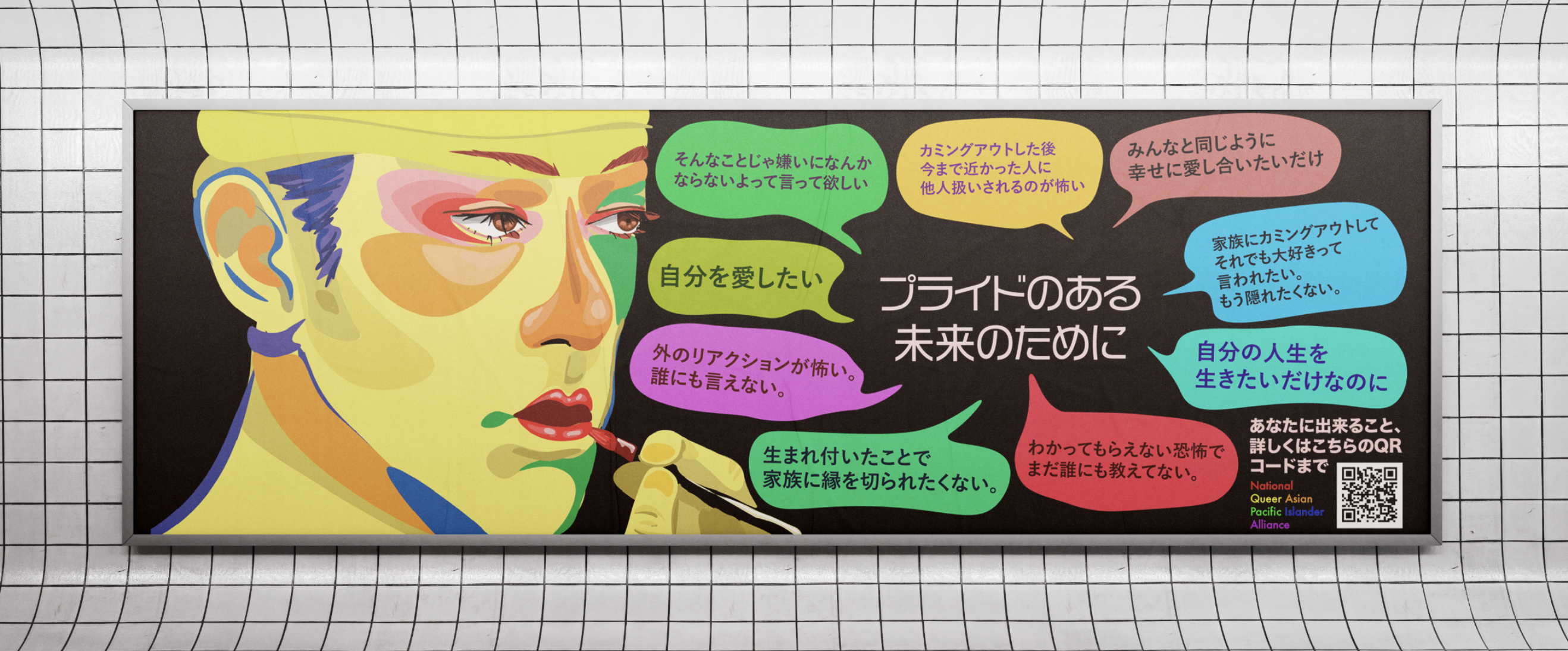
Queer in Japan
Japan is a very conservative society. This project explored how the campaign can catch the eye of the viewer visually and then with its shocking contents—a controversial campaign comparing queerness to Kabuki theater, an exclusively male theater where men play all genders.
The brightly colored Kabuki actor is displayed next to several speech bubbles from Japanese LGBTQ youth, many of which describe the lonely, isolating experience of being an LGBTQ person in a conservative environment, all surrounding the words “for a future with pride.”
This campaign aimed at viewers to grow empathy towards the LGBTQ community, emphasize that LGBTQ individuals are real people in the community, and realize the hypocrisy that exists with being anti-queer in a country with queer history and traditions.
︎ CAMPAIGN DESIGN
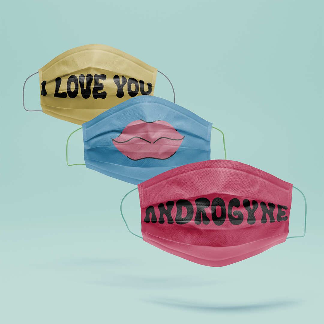
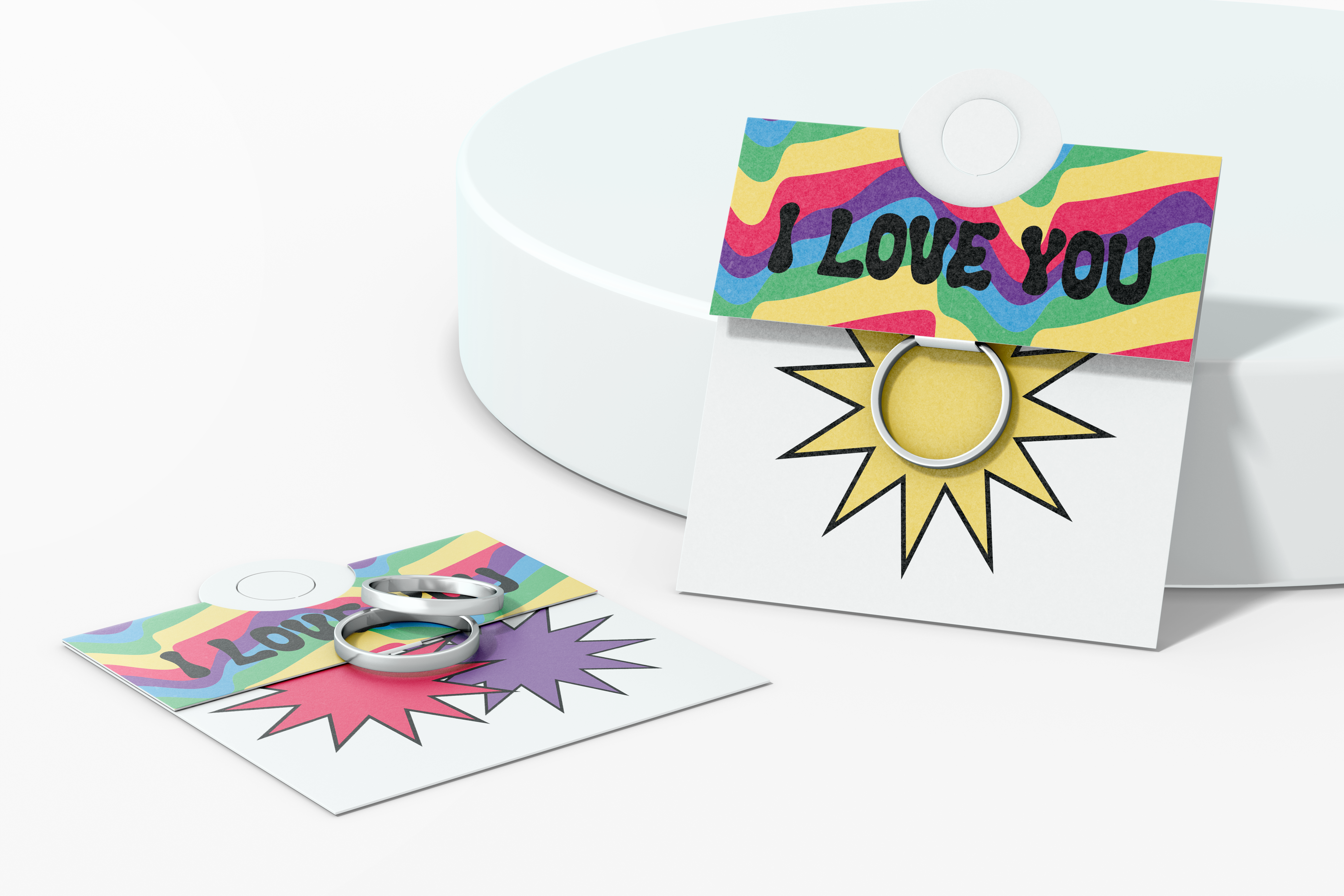
ANDROGYNE
BRAND IDENTITY
Crafting a vibrant and playful identity for Androgyne, a rebellious pop retail brand breaking free from the corporate mold that often stifles queer identities. Our design transforms the clichéd flat rainbow pattern into a dynamic, youthful expression. Androgyne is more than a brand; it's a community that stands against the corporate takeover. We foster a mutual connection with our customers, emphasizing community service and dedicating a portion of our proceeds to support LGBTQ organizations. Join us in creating a bold, impactful statement that goes beyond fashion.
︎ BRANDING


ICON SYSTEM
Graphic Animal skull icon set with Latin labels.
Typeface: Cubano Regular
︎ ICON SYSTEM

BIC CLASSIC LIGHTERS SUSTAINABLE REDESIGN
Redesigning BIC’s classic lighter packaging to become sustainable, removing plastic, revising aesthetics, and improving product experience
︎ PACKAGING DESIGN


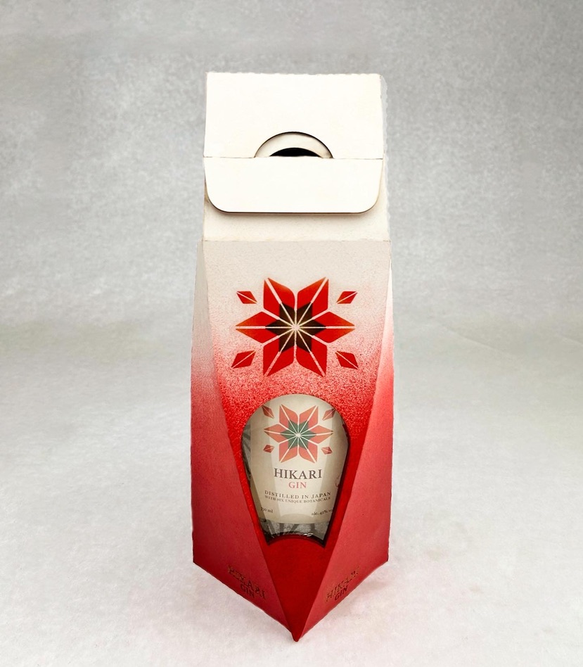
HIKARI GIN
SPIRIT PACKAGING
Hikari Gin is packaged with great detail to light, Hikari translating to light in Japanese, it is designed imaging its potential interactions with light on bar counters, shelfs, and so on.
︎ PACKAGING DESIGN