YAMI YAM!
Conceptual Cafe Branding
MISSION:
- Create a hip new cafe in the theme of Superflat (visually & conceptually)
- Artfully represent the political and societal struggles that run rampage in San Francisco
AUDIENCE:
ART DIRECTION:
- Tourists in San Francisco
- Socially aware youth/Artists
- Gen-Z instram foodies
ART DIRECTION:
- Visual: in theme of Superflat Movement
- Voice: Rebellious, Pop, Viral, Playful and Chaotic
Behind the Name: YAMI YAM!
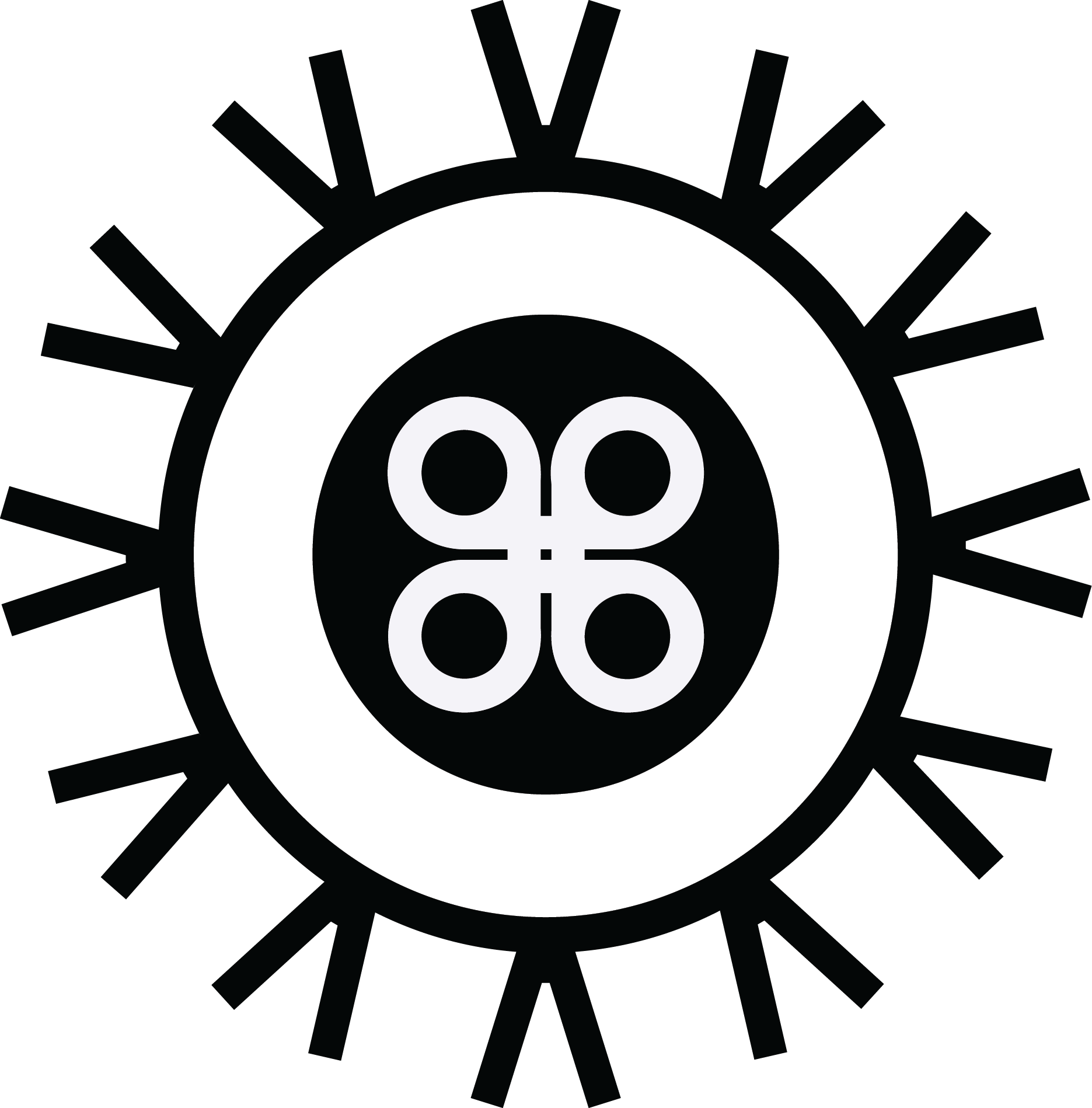
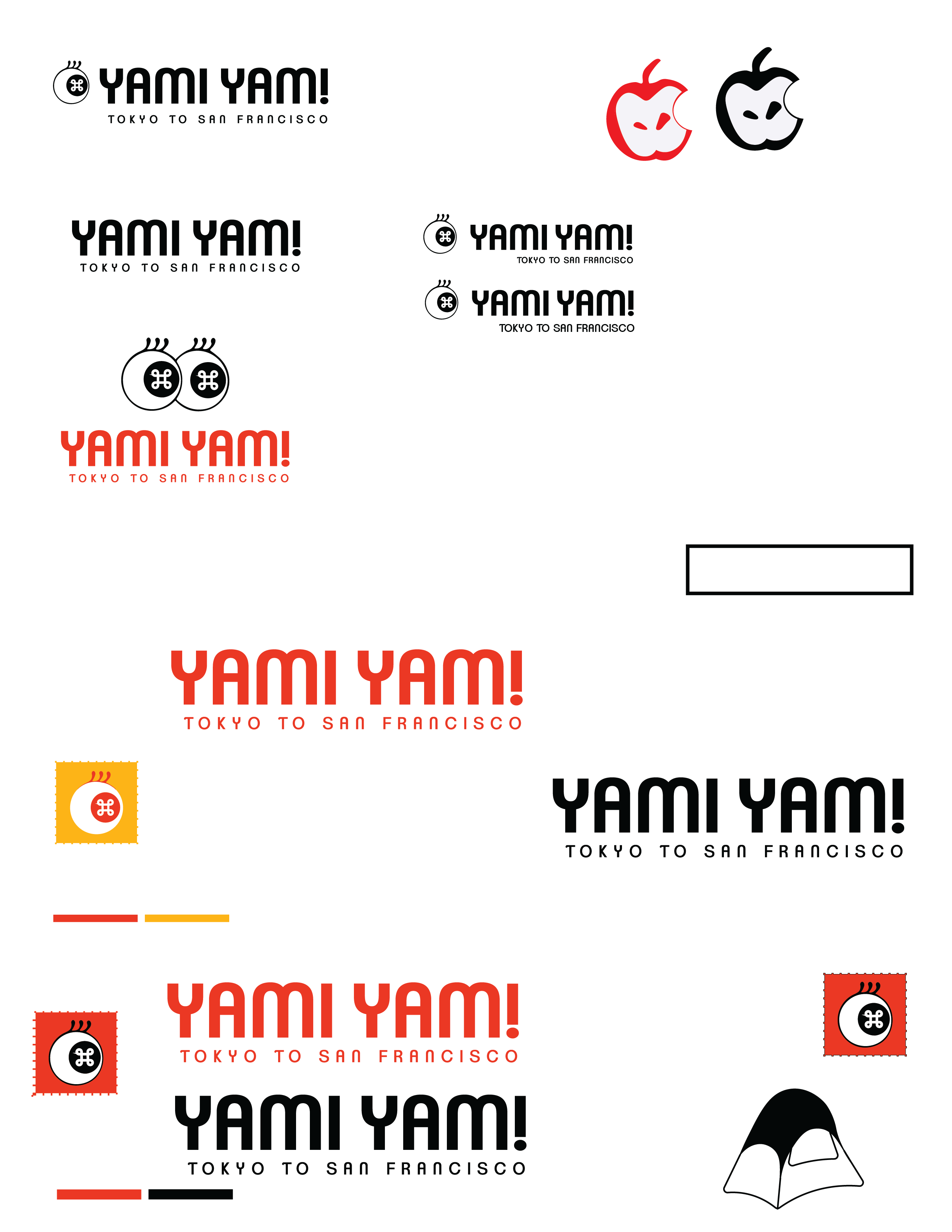
Very first logo visual
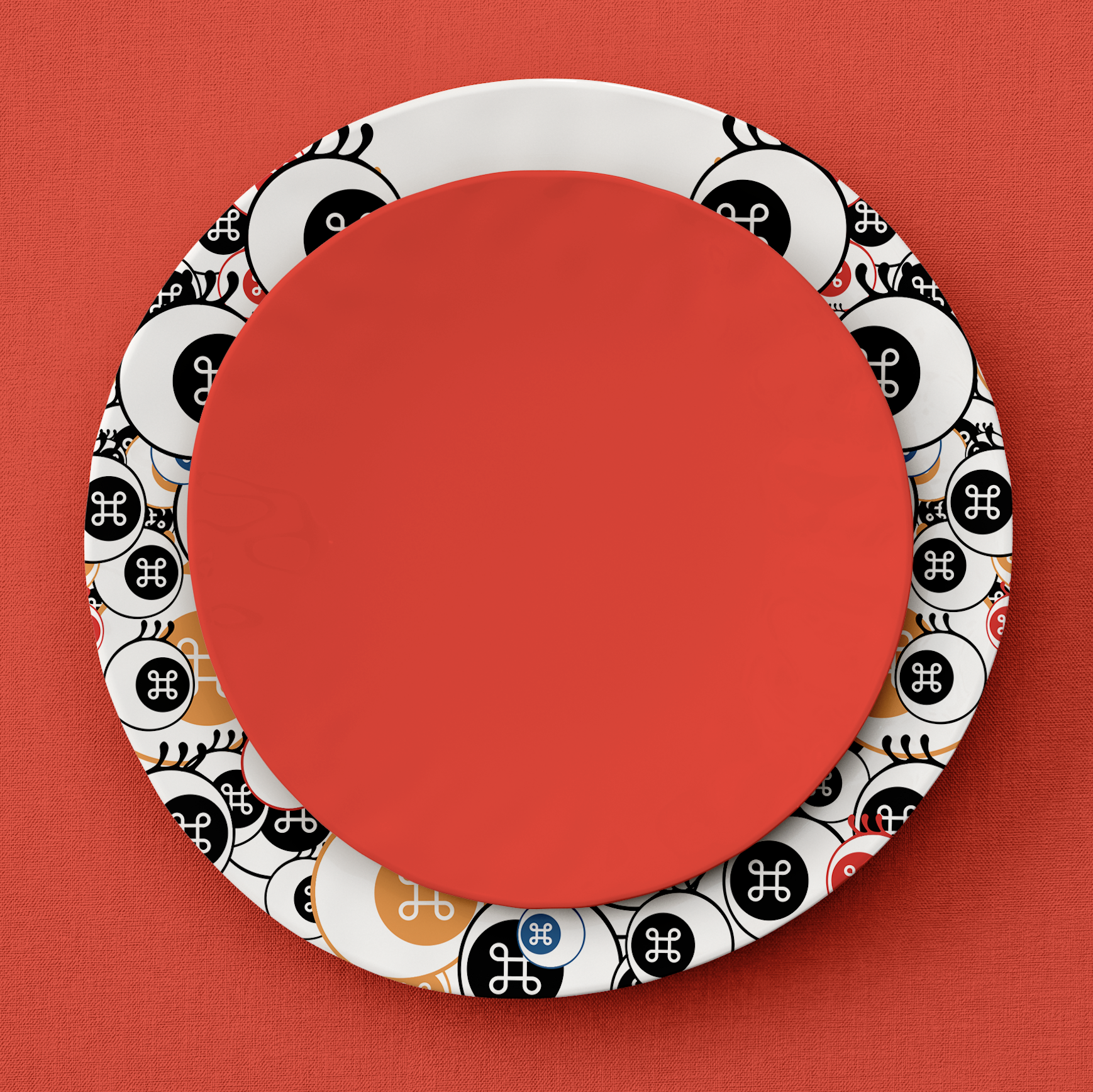
A graphic eyeball with a command symbol reflection in the iris and control symbols as eyelashes
YAMIYAM! has a playful ring to its name with a humorous, dark meaning. The name is a combination of two Japanese words:
Yami: 闇 (darkness) and Yam: 病む (to be sick/mentally unwell).
The combination of two dark words makes up a fun and yummy name, YAMI YAM😋️
The words Yami (闇) and Yam (病む) refer to the current state of San Francisco. The city has unaffordable housing, a growing homeless crisis, thriving tech companies, and drug-addicted people in the same block. The conceptual cafe playfully represents the city that has become dark and depressed over the years, with inspiration to the Superflat art movement.
Logo/Icon Development
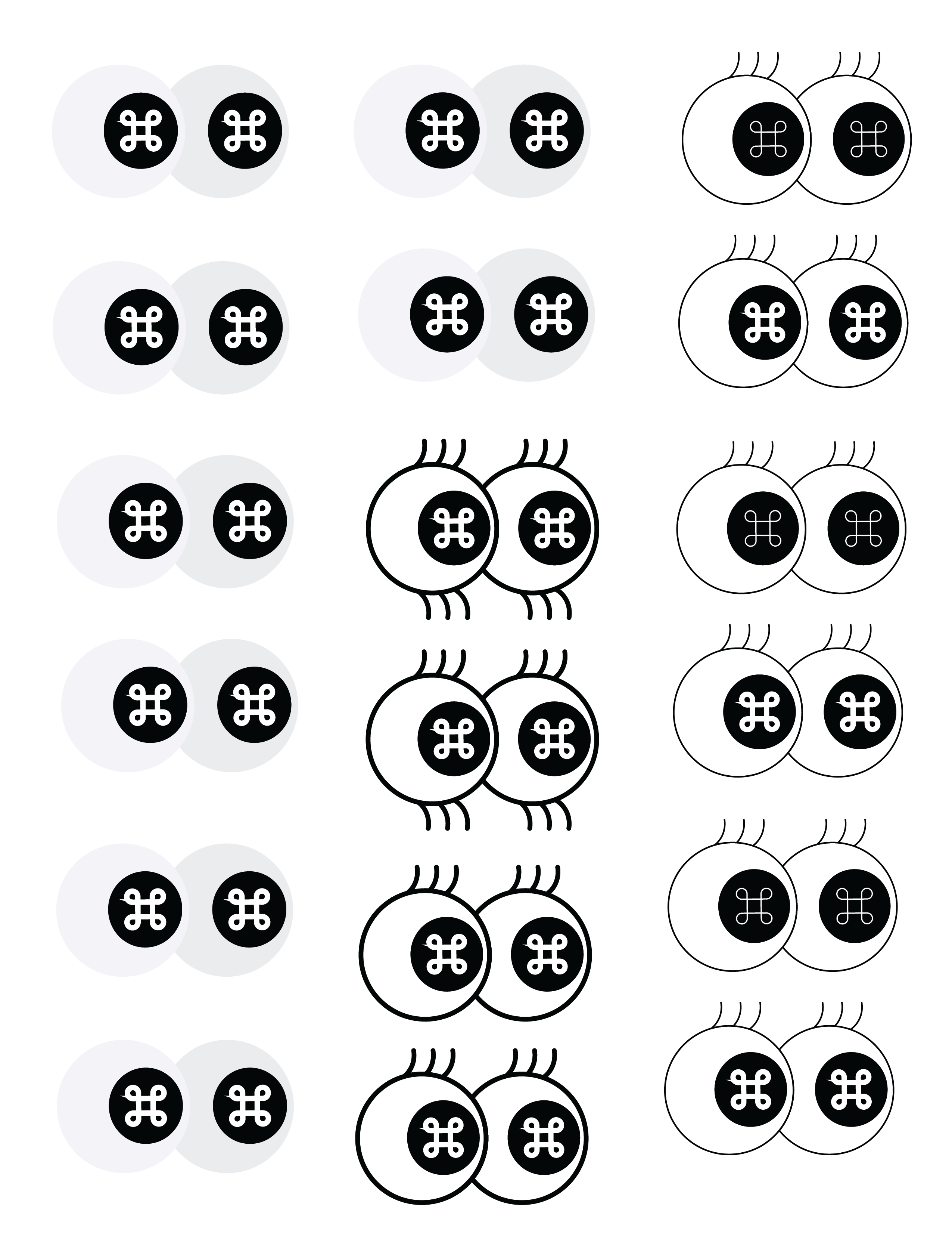
I wanted to envoke the feeling of being surveilled and controlled by tech in the modern world, so designed various eye icons, with a command symbol in the center of the eye.
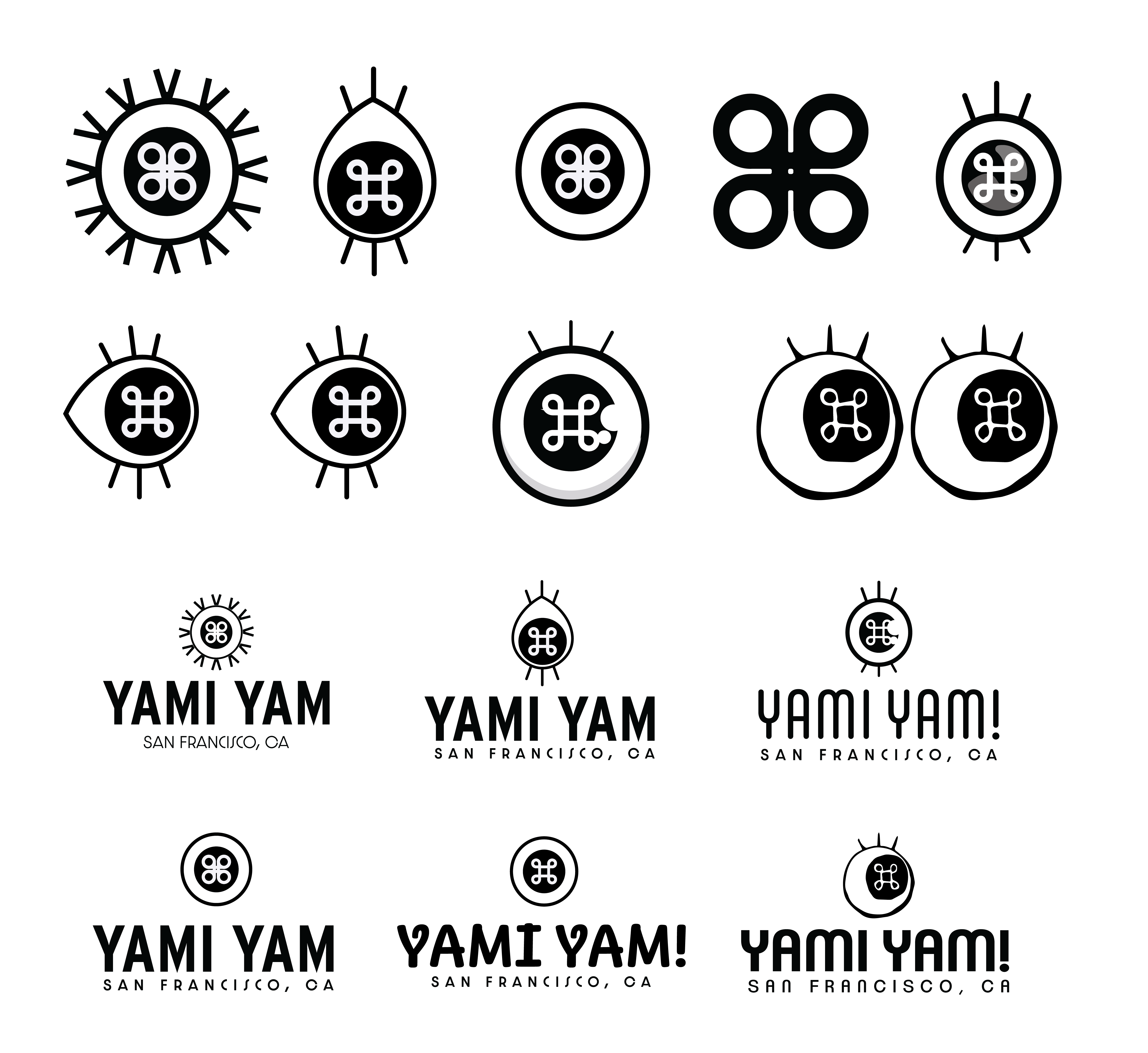
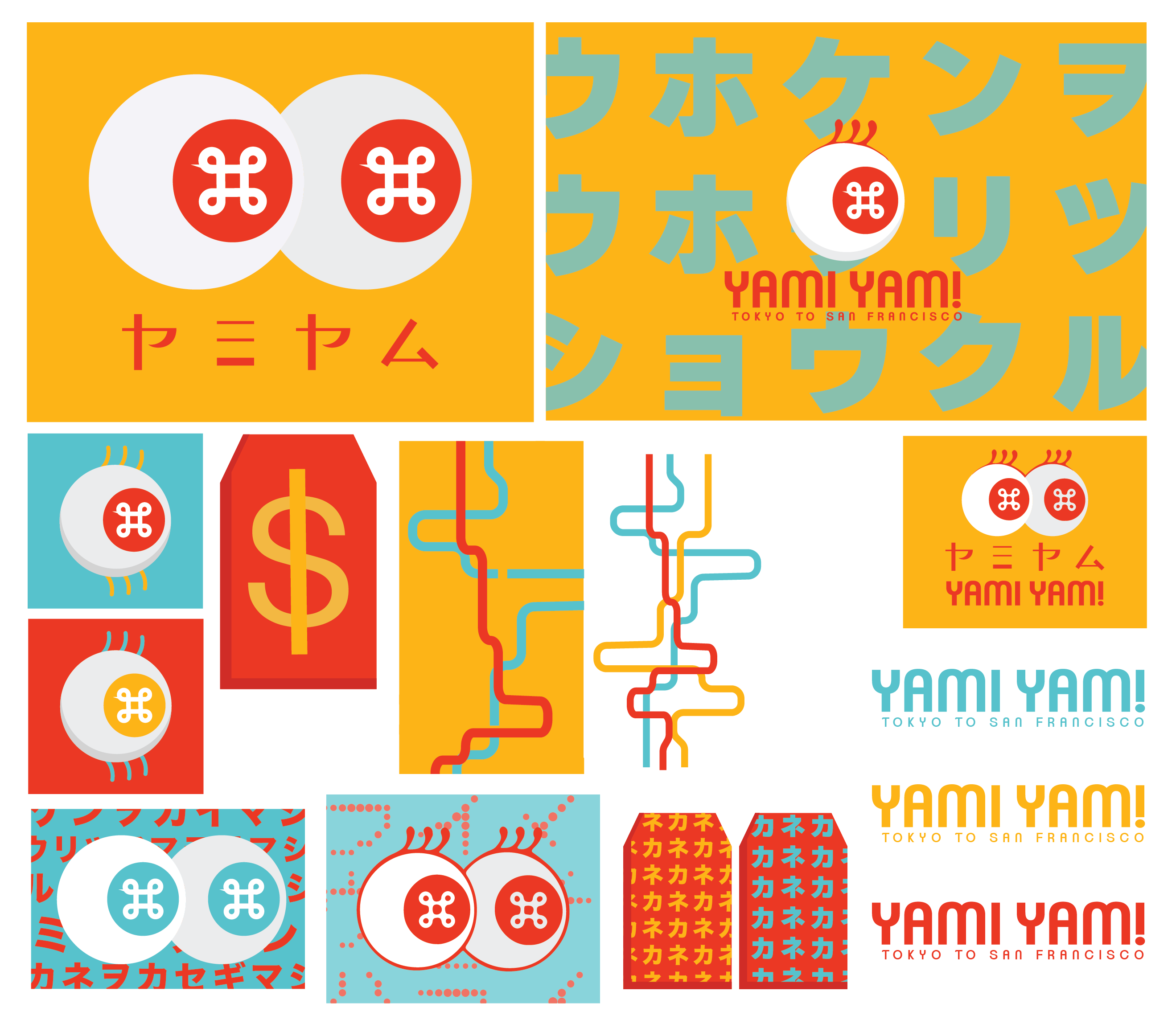
Experimenting with style and aesthetics
Final Logo/Assets
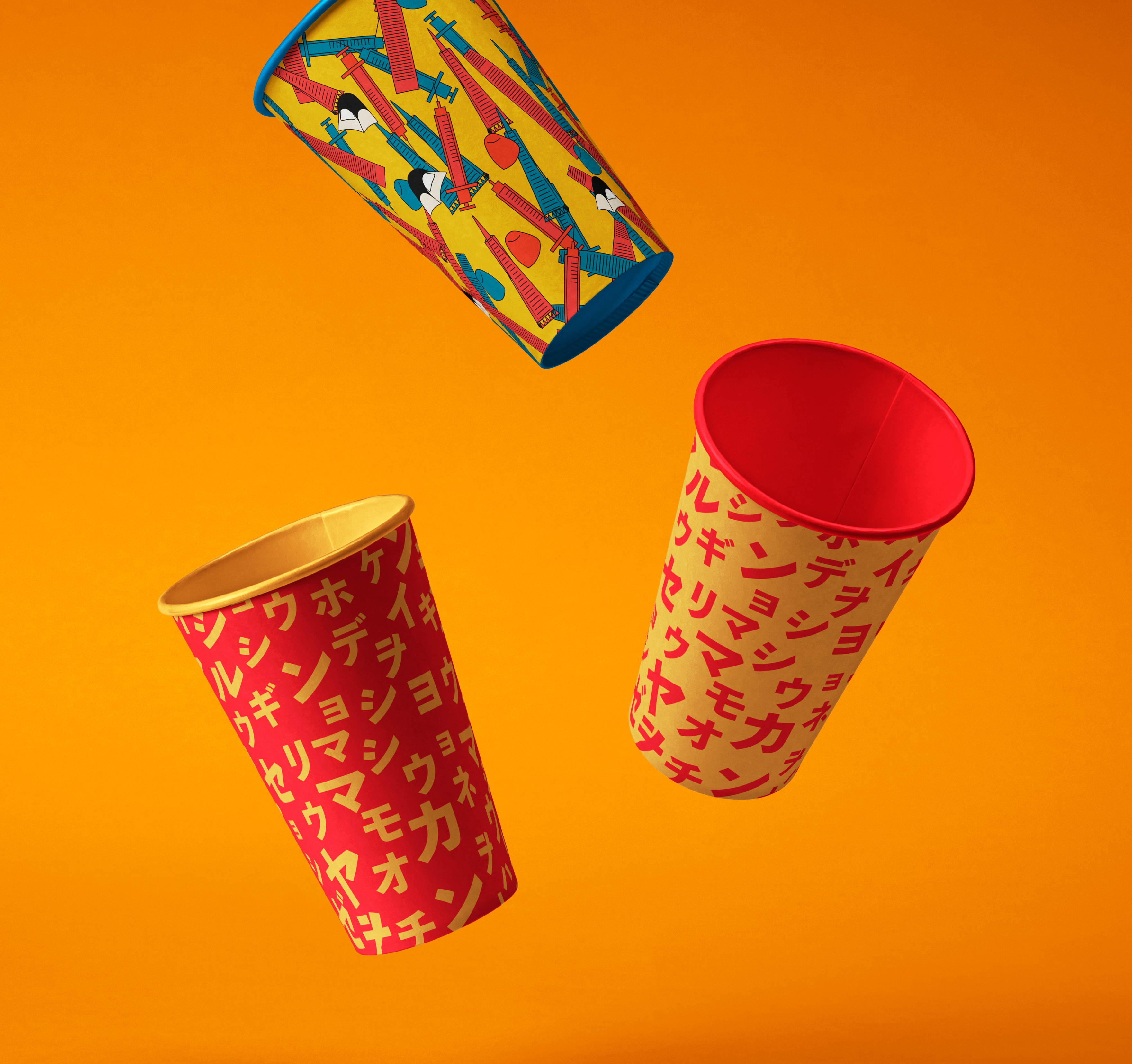
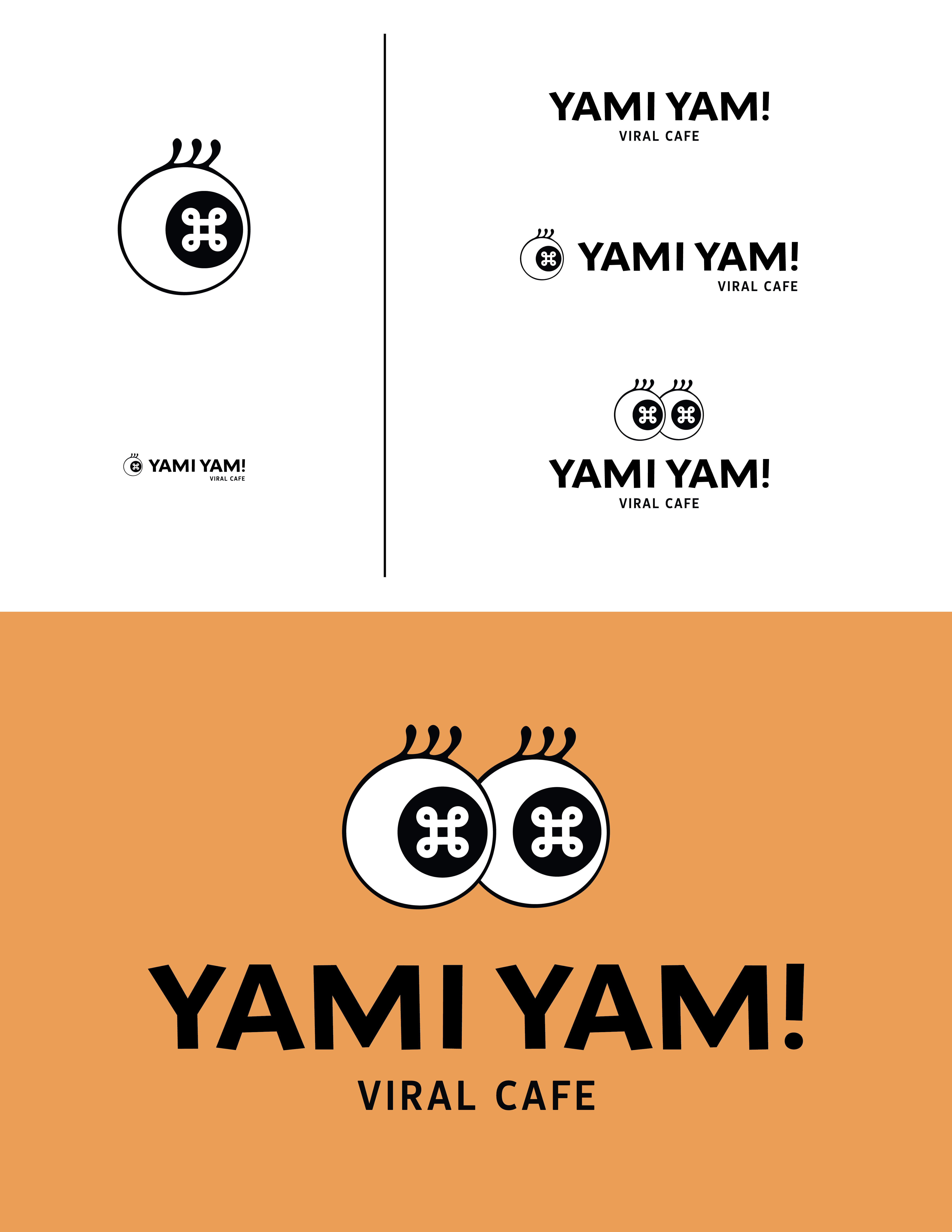
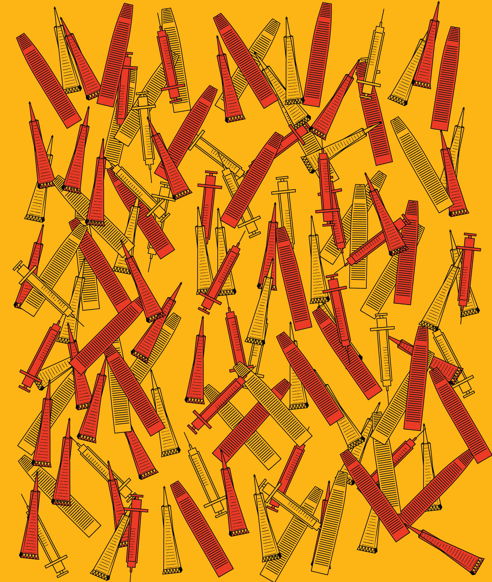
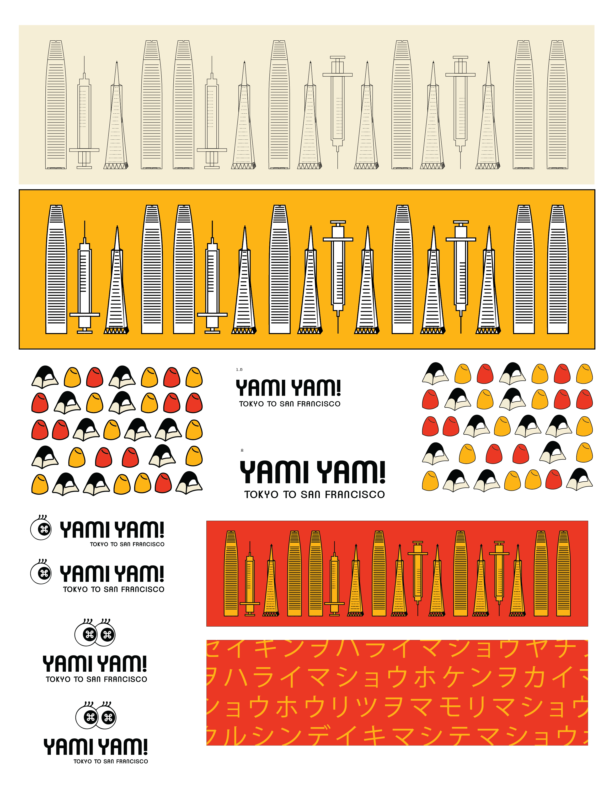
For the final designs I decided to go with a American style comic eye with American classic candy, tents and toy like buildings and syringes as elements. The tone of the designs are fun playful and almost seemingly child appropriate


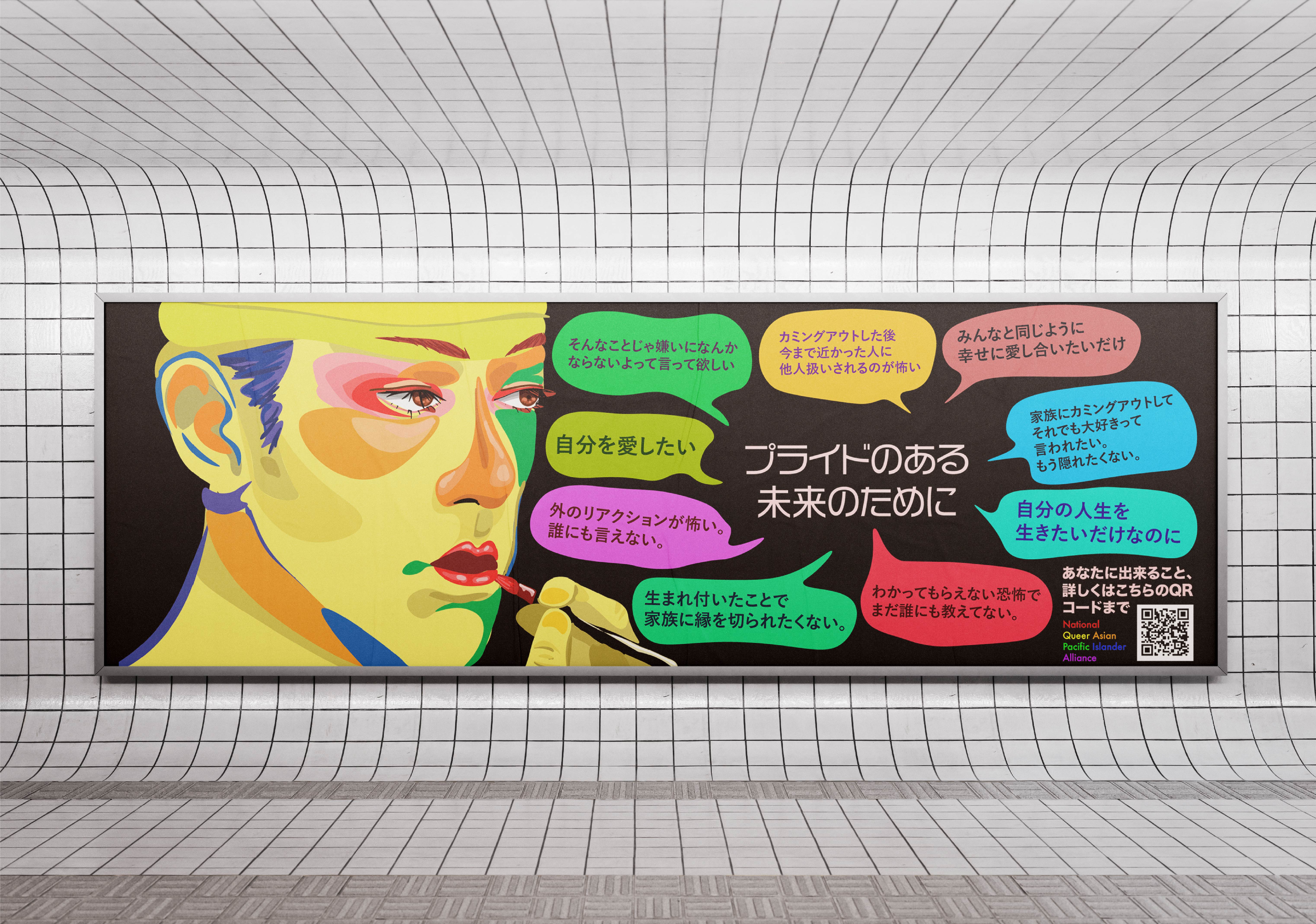
Mockups


